Roblox Logo & Icon: A Complete Historical Guide
Roblox, a popular online game, has seen its logo change a lot over the years. It all began back in 2004 when the creators, David Baszucki and Erik Cassel, introduced the very First Roblox Logo. At that time, Roblox was just starting its incredible journey, and its logo was simple and unique.
As Roblox grew in popularity and more players joined, the logo began to transform. The company wanted the logo to look like the game was becoming more fun and interesting. So, they updated it multiple times to make it more modern and appealing to players of all ages.
Today, the Roblox logo has a vibrant and dynamic look that represents the diverse world of games and experiences within the platform. It’s a symbol of how far Roblox has come since its early days and how it continues to evolve to meet the expectations of its passionate community. So, the next time you see the Roblox logo, remember that it’s not just a design; it’s a visual journey through the history of a remarkable gaming platform.
A Complete History Of Roblox Logo & Icon
The Roblox logo has changed a lot over the years. It started with a simple design when Roblox was first created in 2004 by David Baszucki and Erik Cassel. Back then, Roblox was just beginning its journey, and the old Roblox logo reflected that.
As Roblox logo history unfolded, and Roblox became more popular, the game grew in size and complexity, leading them to update the logo several times. They wanted all Roblox logos to show how exciting and different the game was becoming. So, over time, the Roblox logo evolved to match the changes happening in the game.
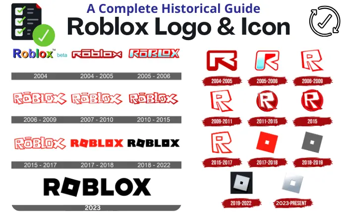
Today, when you look at the Roblox logo, you can see a vibrant and dynamic design that represents all the fun and diverse experiences you can have on the platform. It’s a symbol of how far Roblox has come since it first started, and how it continues to change and improve to make players happy. You can also find various versions of the Roblox logo in different formats like Roblox PNG, and it even incorporates different colors using Roblox Color Codes to add more excitement.
Roblox Logo 2004
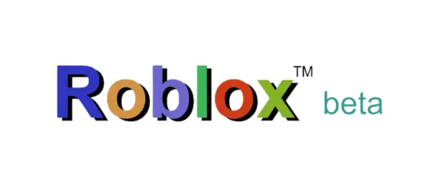
In the early days of Roblox’s inception in 2004, the platform was originally known as DynaBlocks. The logo of that era was a simple representation, featuring the name DynaBlocks in a playful and blocky font. However, as Roblox evolved, so did its visual identity.
Recognizing the need for a more memorable and user-friendly name, the developers made a pivotal decision to rebrand the platform as ‘Roblox.’ This transition was not just about a name change; it also marked a transformation in the logo. The design team seamlessly integrated the new name ‘Roblox’ into the emblem, bidding farewell to the dot in DynaBlocks. An interesting touch was the decision to render the word ‘beta’ in blue, creating a sense of dynamism and evolution.
Yet, what remained constant was the use of vibrant and colorful letters, a signature element that would go on to define the Roblox logo. This transformation was the foundational step in Roblox’s journey, setting the stage for it to become the dynamic and beloved gaming platform it is today.
Roblox Logo 2004-2005
Back in the early days, from 2004 to 2005, when Roblox was just starting, it was called DynaBlocks. The logo at that time was pretty basic. It had the name DynaBlocks written in simple, blocky letters. This logo showed the idea of building and creating things in the Roblox world.
This DynaBlocks logo from 2004-2005 might look plain, but it’s a piece of Roblox history. It reminds us of how Roblox began as a simple idea and grew into something huge. The logo changed a lot over the years to match how Roblox became a place for people to have fun and use their imagination in all kinds of games and adventures.
Roblox Logo 2005-2006
In 2005, something important happened to Roblox. They officially changed its name to Roblox. They also made some changes to the logo, but it still looked somewhat the same. The letters in the logo turned from blue to white with a smooth shift in between. They used a brighter shade of red, made the letters all big and capital, and tilted them a little bit. These tweaks made the logo look more modern and stylish. It was a big step for Roblox and showed that they were ready for the future.
Roblox Logo 2006-2017
In 2006, Roblox stopped testing and officially started. They changed their logo too. Before, the letters looked very square, but now they made them look like someone wrote them by hand. They also filled the letters with white and made the lines around them a bit wavy and thin. This made the logo look more fun and playful, showing that Roblox was a place for creativity and imagination.
Roblox Logo 2017-2018
In early 2017, Roblox came up with a brand new logo, which was its fifth major redesign. This logo had neat and blocky letters, and it was mostly red. The ‘o‘ in the logo was tilted a little, which gave it a modern and interesting look. David Baszucki, the company’s founder, said that this logo represented their commitment to making Roblox a fun and creative place for kids all around the world, no matter where they played.
Roblox Logo 2018-2022
Between 2018 and 2022, the Roblox logo went through some noticeable changes. The biggest one was in the way the letters looked. They went from being big and square to looking more modern and smooth. This made the logo seem cleaner and more current, which matched how Roblox was growing and becoming more interesting to lots of people.
Another important change was in the color. The red in the logo got brighter and more lively, making it feel fresh and full of energy. These changes were made to make the logo more attractive and to show that Roblox was committed to making games that were fun and creative.
In a nutshell, these adjustments in how the letters looked and the color used in the logo were all about showing that Roblox is always thinking ahead and wants to inspire its users to imagine and create in the virtual world.
Roblox Logo 2024
The latest Roblox logo is a bit of an update, but it’s still pretty straightforward. Most of the time, it’s in white, but you can also find it in black or graphite versions. The ‘o’ in Roblox is still tilted, and that’s what makes it stand out as the symbol of the game. It keeps things simple and reminds us that Roblox is all about having fun and being unique.
Roblox
History Of Roblox Icon
The journey of the Roblox icon reflects the platform’s growth and changes over the years. Back in the early days, around 2004-2005, the icon was simple, just a blocky “R“. It symbolized the idea of building and being creative, which was at the heart of Roblox.
Then, during the DynaBlocks era in 2005-2006, they introduced the new name Roblox into the icon and gave it that tilted “o” we all recognize. This tilted “o” became a big part of the brand and represented the platform’s focus on sparking imagination. From 2006 to 2017, the icon got a bit fancier but kept the red “R” and tilted “o”. It showed that Roblox was getting more popular and sticking to its unique style.
Between 2017 and 2022, they gave the icon a modern makeover. The letters became sleeker, and the red color got brighter, showing that Roblox was all about staying dynamic and fresh.
Now, from 2022 onwards, the Roblox icon keeps things modern and usually white but also comes in black and graphite versions. The tilted “o” is still there, reminding us that Roblox is all about creativity. These changes tell us that Roblox is always evolving while staying true to what makes it special.
Roblox Icon 2004-2005
The Roblox icon in 2004 was quite straightforward. It mostly consisted of a blocky letter “R” in either black or grey. This simplicity aimed to capture the essence of what Roblox was all about during its early days – creativity and building. The icon symbolized the idea that users could construct their virtual worlds and unleash their imagination within the Roblox universe. While it may seem basic, this early icon played a crucial role in establishing the foundation for Roblox’s journey towards becoming the dynamic and creative platform that it is today.
Roblox Icon 2005-2006
With the beta version of Roblox, a new icon emerged, signifying an important moment in the platform’s journey. The most prominent change was in the letter “R,” which was stretched vertically and slightly tilted to the right. The corners became rounded, the centerline was adjusted, and the pink gradient was replaced with a vibrant blue. The surrounding frame adopted a bold red.
These changes were significant, representing Roblox’s growth during the beta phase and a commitment to a more dynamic and visually appealing identity. The redesigned icon symbolized Roblox’s evolving journey and its goal of offering an exciting and creative virtual world.
Roblox Icon 2006-2009

Between 2006 and 2009, the Roblox icon underwent some significant changes, marking a shift in the platform’s identity. The earlier icon, with its stretched and tilted “R” and rounded corners, made way for a more streamlined and modern design.
In this redesigned icon, simplicity took center stage. The letter “R” became crisper, with straighter lines and sharper edges. The blue gradient remained, adding depth and dimension to the letter, while the bold red frame surrounding the icon retained its eye-catching appeal.
These alterations in the Roblox icon from 2006 to 2009 aimed to provide the platform with a more contemporary and visually appealing look. They reflected Roblox’s growing popularity and its commitment to staying in tune with the evolving tastes and expectations of its user base.
Roblox Icon 2009-2011
The updated Roblox icon, while bearing a resemblance to its predecessor, featured subtle yet distinct alterations. These changes included the rounding of certain corners, adjustments to the spacing within the letter, and modifications to the thickness of the outlines. This revised version served as the app icon and also represented Roblox Studio and Roblox Player as graphic symbols.
Roblox Icon 2011-2015
Between 2011 and 2015, Roblox’s icon underwent significant changes to keep pace with the platform’s growth. The major shift was from a somewhat blocky, three-dimensional “R” to a sleeker, two-dimensional design. The glossy texture was replaced with a flat and vibrant red color, making the icon more visually appealing and easily recognizable. These updates reflected Roblox’s commitment to modernization and attracting a wider audience.
Roblox Icon 2015-2017
Between 2015 and 2017, the Roblox icon went through some significant changes to make it look more modern and simple. The most important change was to the letter “R.” It used to look a bit shiny and 3D, but they made it flat and simple. The color stayed red, but it became a deeper and solid red.
All these changes were made to keep the icon recognizable but also make it look more up-to-date. Roblox wanted to appeal to lots of different people, and these changes helped them do that. It showed that Roblox was keeping up with the times and staying cool in the gaming world.
Roblox Icon 2017-2018
The Roblox icon from 2017-2018 was a blue square with the word “Roblox” written in white letters. Inside the square, there was also a stylized white “R” in the upper left corner of the word. This icon was used as the logo for the Roblox platform during that period. Please note that the design of logos and icons can change over time, so there may have been updates or revisions to the Roblox icon since then
Roblox Icon 2018-2019

- The primary Roblox logo during that time featured the word “Roblox” written in bold, uppercase letters with a custom font. The “R” and “b” in “Roblox” were slightly tilted to the right for a playful appearance.
- This text was usually displayed in a dark blue color.
- The text “Roblox” was inside a white, rectangular or square background, often with slightly rounded corners.
- There might have been a small gap or spacing between the “R” and “o” in “Roblox.”
- There was no stylized “R” in the upper left corner of the word during this period.
Roblox Icon 2019-2023
The current Roblox logo has a silver “O” with a cool shading effect. It stands on the edge of a black square, which makes it look very different and interesting. You can see this logo on social media and inside the Roblox app.
When you see the icon for Roblox Player, it’s like a diamond-shaped “O” on a white background. It looks 3D because of the black and grey shadows, which give it a sense of depth and make it stand out.
These design choices help Roblox look modern and exciting. They show that Roblox is a fun and creative place for gaming and virtual adventures.
Roblox Icon 2024- Till Now
In 2024, Roblox Corporation gave its logo and app icon a fresh look. Now, their app icon is mostly grey, with a little bit of white at the top. They kept the cool shading effect, but it’s a bit more even and noticeable now.
The important thing is that they didn’t change the famous slanted design that makes Roblox unique. This slant has been part of their look for a long time, and it helps people quickly recognize the brand. So, even with the update, Roblox still keeps its unique style that players and fans know and love.
Conclusion
In 2024, Roblox Corporation decided to give its logo and app icon a fresh look. The logo, which is the main symbol for the company, used to have white letters on a blue background with a cool “R” design. But now, it’s different. The new logo has a silver, shiny “O” on a black square, and the rest of the letters are white. They kept the slanted style because it’s what makes Roblox special and easy to recognize.
As for the app icon, the little picture you see on your phone, it’s mostly grey with a bit of white at the top. They also added some shadows to make it look cooler. But again, they made sure to keep the slanted design because it’s like Roblox’s signature look.
So, in a nutshell, Roblox updated its logo and app icon to look more modern, but they didn’t forget what makes them unique that slanted style that we all know and love.
You can visit the official Roblox site.

Roblox Logo & Icon

FAQ’s
